
1. Oversized Entryway With Nowhere to Sit
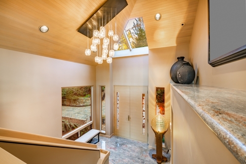
A grand foyer looks impressive in photos, but it often eats up square footage that could have gone to living space. When the entry is cavernous and empty, it usually means daily needs like coat storage and seating were afterthoughts. Homes designed for comfort typically include a bench, hooks, or a closet right where you need them. Without those basics, the space becomes something you walk through, not something that helps you live.
This kind of layout is common in spec homes meant to wow buyers during a quick walkthrough. Builders know tall ceilings and sweeping staircases photograph well and suggest luxury. What they don’t show is the daily annoyance of juggling shoes, bags, and jackets with nowhere to put them. That mismatch between visual drama and everyday use is the giveaway.
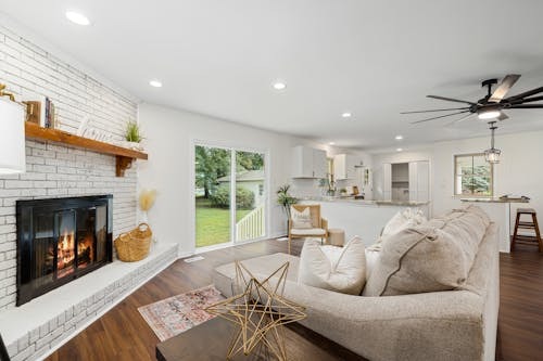
2. Furniture-Hostile Living Rooms
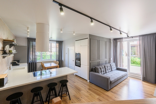
If a living room looks stylish but is oddly hard to furnish, that’s a red flag. Too many doors, windows, or angled walls can leave no logical place for a sofa or TV. Comfort-focused design starts with clear wall space and predictable room geometry. When every layout option feels wrong, the room was likely drawn for symmetry, not use.
This often happens when exterior elevation is prioritized over interior function. Large windows may be placed for curb appeal without considering glare or furniture placement. The result is a room that looks balanced from the outside but feels awkward inside. People end up floating furniture or blocking pathways just to make it work.
3. Kitchens With Style Over Workflow
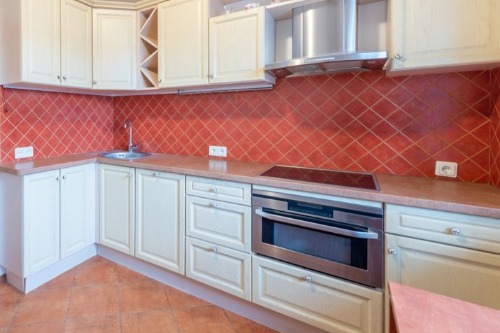
A beautiful kitchen can still be frustrating if the layout ignores how people actually cook. Excessively long distances between the sink, stove, and refrigerator break the basic work triangle. That triangle is a well-established planning principle because it reduces steps and congestion. When it’s ignored, cooking becomes slower and more tiring.
Show kitchens often prioritize statement islands or dramatic ranges for visual impact. Those features photograph well but can crowd walkways or block cabinet access. You might notice multiple cooks bumping into each other during normal meal prep. That’s a sign the space was staged for admiration, not daily use.
4. Minimal Storage Disguised as Clean Design
Homes designed to look sleek often skimp on closets, cabinets, and utility storage. Open shelving and hidden storage can be useful, but only in limited amounts. Most households need places for vacuums, linens, tools, and seasonal items. When those are missing, clutter quickly spills into living areas.
This choice is common in designs chasing a minimalist aesthetic. Empty surfaces and clean lines make rooms feel larger in photos and showings. The reality is that people still own the same amount of stuff. Lack of storage shifts the burden onto the homeowner instead of the design.
5. Dramatic Lighting With Poor Practical Coverage

A chandelier or sculptural pendant can look stunning, but it doesn’t light a room by itself. Comfortable homes rely on layered lighting, including ambient, task, and accent sources. When overhead fixtures are the only light, shadows and glare become problems. This is especially noticeable in kitchens, bathrooms, and work areas.
Designs focused on appearance often treat lighting as décor rather than infrastructure. A single statement fixture is easier to sell visually than a thoughtful lighting plan. The downside shows up at night when rooms feel dim or unevenly lit. People end up adding lamps and retrofits to fix what should have been planned.
6. Echoey Spaces With Hard Surfaces Everywhere
Rooms full of hard materials can look modern and upscale at first glance. Stone floors, bare walls, and high ceilings reflect sound instead of absorbing it. The result is echo, noise travel, and a constant low-level discomfort. Comfortable homes balance hard finishes with soft ones like rugs, drapery, and upholstery.
Acoustics are rarely visible in listing photos or floor plans. That makes them easy to ignore during design focused on visual impact. You often notice the issue only after moving in and hearing conversations bounce. Poor acoustics are a classic sign of style winning over livability.
7. Awkward Traffic Flow Between Rooms
In a comfortable home, movement from room to room feels intuitive. When paths cut through seating areas or narrow pinch points, daily life gets disrupted. This often shows up as furniture arranged to protect walkways instead of comfort. Good layouts separate circulation paths from places meant for rest.
Appearance-driven plans may emphasize dramatic sightlines or symmetry. Those choices can force people to cross living spaces just to reach another room. It looks impressive standing still but breaks down during normal use. Traffic flow problems are hard to fix without major renovation.
8. Bathrooms That Look Luxe but Function Poorly
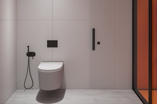
A spa-like bathroom can still be uncomfortable if basics are overlooked. Common issues include vanities with no counter space or storage. Freestanding tubs may look elegant but are often rarely used. Comfort comes from ease of use, not just visual calm.
Designs aimed at selling often highlight dramatic tubs and finishes. Everyday realities like towel storage and outlet placement get less attention. Over time, the novelty wears off and frustration sets in. That gap reveals a bathroom designed to impress, not support routines.
9. Bedrooms With Great Views but Poor Sleep Conditions
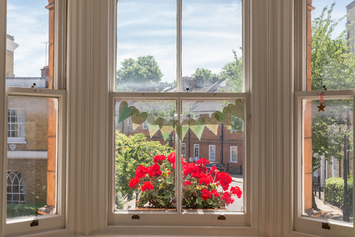
Large windows and dramatic vistas can make a bedroom feel luxurious. They can also introduce excess light, noise, and temperature swings. Comfort-focused bedrooms prioritize darkness, quiet, and consistent climate. When those basics are compromised, sleep quality suffers.
Floor-to-ceiling glass often appears in homes marketed for visual appeal. Window placement may favor exterior symmetry over interior comfort. Blackout shades and soundproofing become necessary fixes. That’s a clue the design favored looks over rest.
10. Outdoor Spaces That Photograph Better Than They Function
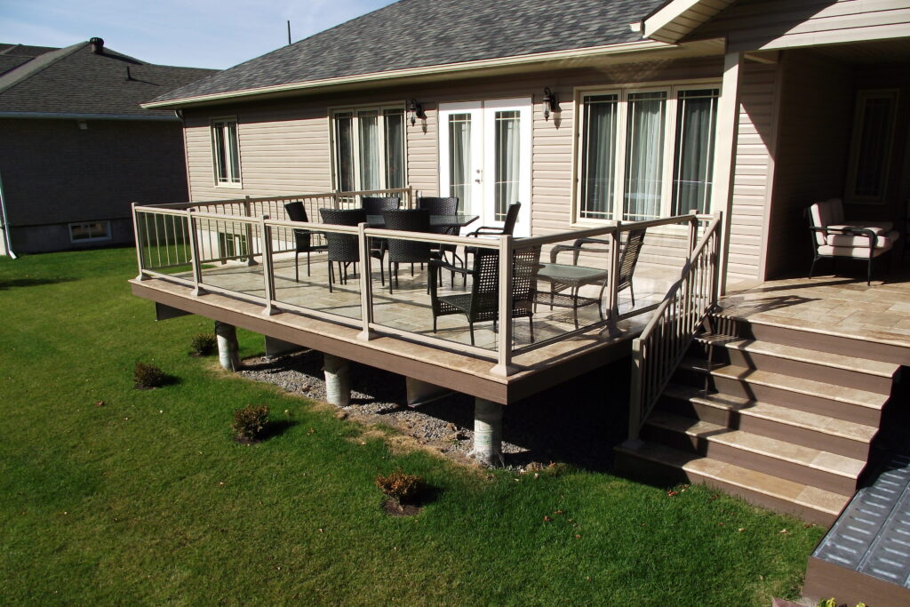
Oversized decks and patios can look like a major selling point. Without shade, wind protection, or easy access, they go largely unused. Comfortable outdoor spaces are scaled for furniture and daily habits. They also consider sun angles and privacy.
Appearance-driven designs often add outdoor space to boost perceived value. The focus is on size rather than usability. Homeowners later realize the area is uncomfortable for most of the day. That disconnect signals a design meant to impress at first glance.
11. Mechanical Systems Hidden Without Thought
Heating, cooling, and ventilation aren’t glamorous, but they define comfort. When vents are poorly placed or undersized, rooms feel uneven. Mechanical rooms tucked into tight corners can be hard to service. Good design integrates these systems early, not as an afterthought.
Homes built for appearance often hide equipment to preserve clean lines. That can lead to noise issues or limited airflow. Problems show up as hot spots, cold spots, or constant adjustments. Those symptoms usually trace back to design priorities, not maintenance.
This post Signs a Home Was Designed for Appearances, Not Comfort was first published on Greenhouse Black.