
1. Glossy, Reflective Surfaces
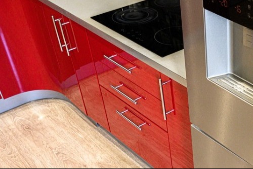
High-gloss finishes are easy to wipe down and visually signal cleanliness. Kitchens often use lacquered cabinets or polished stone for that reason. Light bouncing off reflective surfaces creates a crisp, sharp aesthetic. That clarity can feel fresh and modern.
Too many glossy finishes can resemble commercial or medical environments. Sterile spaces often rely heavily on shine without balancing textures. Clean homes pair gloss with softer elements like wood or fabric. That contrast keeps the room from feeling cold.
2. All-White Color Palettes
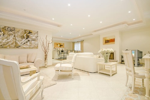
An all-white room instantly reads as clean because it reflects light and minimizes visual clutter. Hospitals and galleries use white for similar reasons: it signals order and hygiene. In a home, though, too much white can feel clinical instead of calming. The absence of warmth or contrast can make a space feel more like a showroom than a lived-in environment.
The key difference between clean and sterile here is visual warmth. Clean white spaces usually include texture, like linen, wool, or matte paint finishes. Those materials soften the effect without sacrificing brightness. Sterile spaces skip those layers, which can make everything feel flat and impersonal.
3. Hidden Storage Everywhere
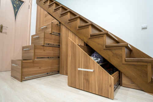
Concealed storage is a hallmark of tidy homes because it removes visual noise. Built-ins, closed cabinets, and under-bed storage keep surfaces clear. This organization signals intention and care, which reads as cleanliness. But when everything disappears, a room can lose its personality.
Sterile spaces often hide not just clutter, but character. A clean home still shows signs of life, like a favorite book stack or a ceramic bowl. Visible objects help tell a story about who lives there. Without them, a space can feel more like a staged model than a real home.
4. Minimal Decor Styling

Minimal styling emphasizes negative space, which gives the eye room to rest. Designers use this technique to make rooms feel calm and orderly. A few carefully chosen pieces can look polished and intentional. That restraint is what communicates cleanliness.
Sterility creeps in when minimal becomes empty. If surfaces lack variation in shape, material, or color, they stop feeling curated. Clean minimalism still includes focal points and visual rhythm. Sterile minimalism removes so much that the space feels emotionally distant.
5. Perfectly Symmetrical Layouts
Symmetry creates visual order, which our brains interpret as neatness. Matching lamps or evenly spaced furniture instantly make a room feel organized. This balance is a classic design principle used in formal interiors. It communicates control and intention.
Sterility appears when symmetry becomes rigid. Real homes benefit from slight asymmetries that add energy and movement. A clean room might include a deliberate mismatch or layered styling. That subtle imperfection keeps the space human.
6. Neutral-Only Color Schemes
Neutral palettes are popular because they feel calm and cohesive. Beige, gray, and taupe reduce visual clutter and unify a room. Designers use neutrals as a base to create a serene atmosphere. This restraint reads as tidy and composed.
A fully neutral room without variation can feel emotionally flat. Sterile interiors often lack accent colors that add life. Clean spaces introduce warmth through undertones or natural materials. Even small shifts in hue can prevent monotony.
7. Bare Countertops
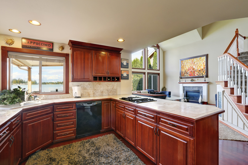
Clear countertops signal cleanliness because they resemble freshly cleaned surfaces. Kitchens and bathrooms especially benefit from open workspace. It makes cleaning easier and visually communicates hygiene. The simplicity feels intentional.
When counters are completely empty, the space can feel unused. Sterile styling removes even functional or decorative items. A clean home might keep a soap dispenser or fruit bowl visible. Those small touches suggest real daily life.
8. Uniform Lighting Temperature

Consistent lighting temperature creates visual harmony. Warm or cool bulbs used intentionally make a space feel cohesive. Designers often standardize lighting to avoid clashing tones. This uniformity contributes to a polished look.
Sterility happens when lighting is overly bright or clinical. Cool white lighting, common in offices, can flatten a room’s atmosphere. Clean homes balance brightness with warmth. The goal is clarity without harshness.
9. Matching Furniture Sets
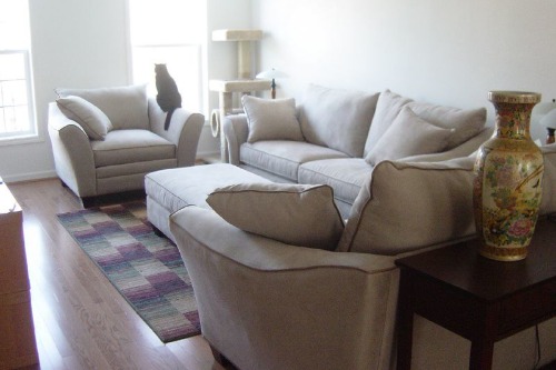
Coordinated furniture sets simplify decision-making and create instant cohesion. Matching finishes and silhouettes signal organization. Many retailers design sets specifically to produce a unified look. This consistency reads as neat and deliberate.
Sterile spaces lean too heavily on uniformity. When everything matches perfectly, the room can lack depth. Clean interiors mix pieces while maintaining a common thread. Variation adds personality without sacrificing harmony.
10. Sparse Wall Decor
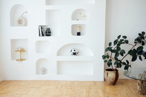
Limited wall decor reduces visual clutter and keeps a room feeling open. Designers often recommend fewer, larger pieces for a cleaner aesthetic. Negative wall space allows artwork to breathe. This restraint communicates intention.
A completely bare wall can feel unfinished or impersonal. Sterile interiors avoid decoration to the point of emptiness. Clean homes include art or personal photos that add warmth. Those elements create emotional connection.
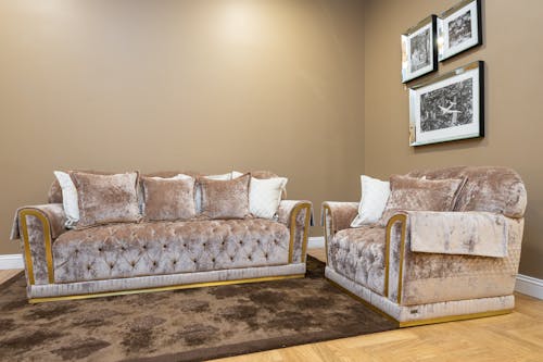
11. Crisp, Tailored Textiles
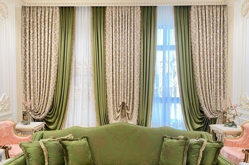
Smooth bedding, tailored curtains, and wrinkle-free upholstery signal care. Hotels use crisp textiles to communicate cleanliness and luxury. Sharp lines and fitted fabrics create a refined appearance. This precision feels fresh and orderly.
Sterility emerges when textiles lack softness or variation. Overly stiff fabrics can make a room feel formal and uninviting. Clean spaces balance structure with comfort. Texture and drape keep the environment welcoming.
This post The Line Between Clean and Sterile Home Decor was first published on Greenhouse Black.